library(survival.calib)
library(survival)
library(riskRegression)
library(dplyr)
library(ggplot2)

knitr::opts_chunk$set(fig.width=7, fig.height=5)
Overview
Data
For this example, we’ll use a standard dataset, survival::flchain, with some very light modifications.
# drop rows with missing values for simplicity
data_init <- na.omit(flchain)

data_init$chapter <- NULL

head(data_init)
#>   age sex sample.yr kappa lambda flc.grp creatinine mgus futime death
#> 1  97   F      1997  5.70  4.860      10        1.7    0     85     1
#> 2  92   F      2000  0.87  0.683       1        0.9    0   1281     1
#> 3  94   F      1997  4.36  3.850      10        1.4    0     69     1
#> 4  92   F      1996  2.42  2.220       9        1.0    0    115     1
#> 5  93   F      1996  1.32  1.690       6        1.1    0   1039     1
#> 6  90   F      1997  2.01  1.860       9        1.0    0   1355     1
We’ll also use a simple split of the data for training and testing.
Model fitting
Suppose we have two model specifications that we want to compare:
Model 1: use
trt,sex, andstageto predict risk for mortalityModel 2: use
age,biliandplateletto predict risk for mortality.
Code to fit these models to the training data is below:
Code to fit these models to the training data is below:
model_1 <- coxph(Surv(futime, death) ~ age + sex,
                 data = data_train,
                 x = TRUE)

model_2 <- update(model_1, . ~ . + lambda + kappa + creatinine)

# compute predicted risk at 2000 days post baseline
time_predict <- c(2000)

predrisk_1 = predictRisk(model_1, newdata = data_test, times = time_predict)
predrisk_2 = predictRisk(model_2, newdata = data_test, times = time_predict)

scal_2000 <- scalib(pred_risk = list(predrisk_1[,1],
                                     predrisk_2[,1]),
                    pred_horizon = time_predict,
                    event_status = data_test$death,
                    event_time = data_test$futime) %>%
  scalib_gnd() %>%
  scalib_hare()
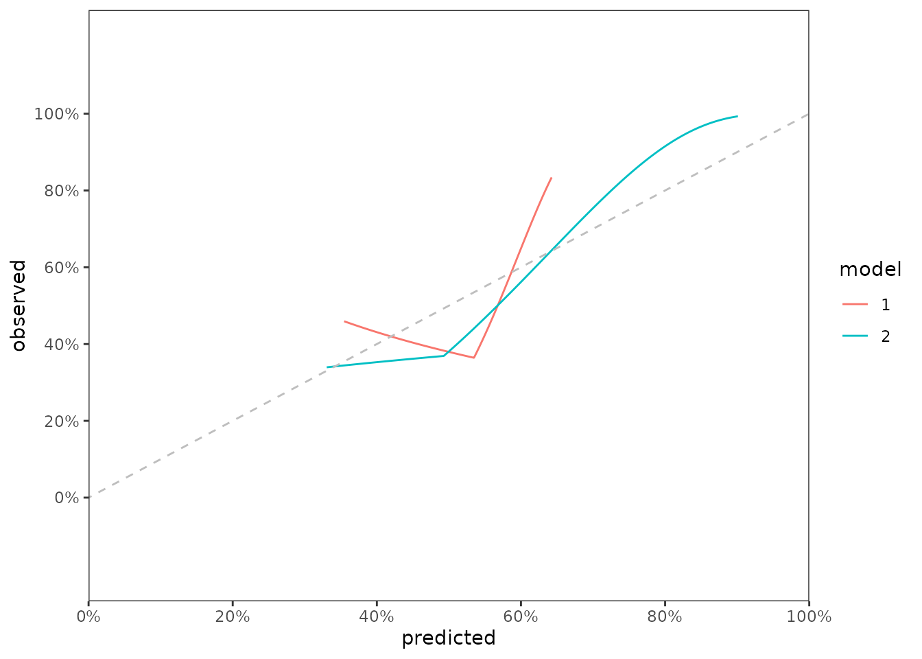
Now let’s combine the data and create a graph showing both curves.
data_calslope <- bind_rows(scal_2000$data_outputs$hare_data_plot,
                           .id = 'model')

fig_cal_slopes <- ggplot(data_calslope) +
  scale_y_continuous(limits = c(-0.2, 1.2),
                     breaks = seq(0, 1, by = 0.2),
                     labels = paste0(seq(0, 100, by = 20),"%")) +
  aes(x = predicted, y = observed, color = model) +
  geom_line() +
  geom_abline(col = 'grey', linetype = 2, intercept = 0, slope = 1) +
  scale_x_continuous(limits = c(0,1),
                     expand = c(0,0),
                     breaks = seq(0, 1, by = 0.2),
                     labels = paste0(seq(0, 100, by = 20),"%")) +
  theme_bw() +
  theme(panel.grid = element_blank())

fig_cal_slopes
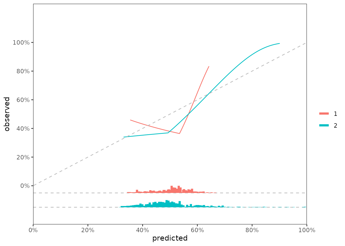
It’s standard practice to show the distribution of predicted risk underneath the calibration slope plots. For this visualization, we can use predrisk_bin_segments, which creates a dataframe containing all of the aesthetics required for geom_segment().
segment_1 <- predrisk_bin_segments(x = predrisk_1,
                                   event_status = data_test$status,
                                   event_time = data_test$time,
                                   bin_yintercept = -0.05,
                                   bin_length = 1/2)

segment_2 <- predrisk_bin_segments(x = predrisk_2,
                                   event_status = data_test$status,
                                   event_time = data_test$time,
                                   bin_yintercept = -0.15,
                                   bin_length = 1/2)

data_segment <- bind_rows(segment_1, segment_2,.id = 'model')
fig_cal_slopes +
  geom_hline(yintercept = -0.05, linetype = 2, color = 'grey') +
  geom_hline(yintercept = -0.15, linetype = 2, color = 'grey') +
  geom_segment(data = data_segment,
               inherit.aes = FALSE,
               size = 1.5,
               mapping = aes(x = x,
                             y = y,
                             color = model,
                             xend = xend,
                             yend = yend)) +
  labs(color = '')